
AUSTERRA —
Wealth Management from 30,000 Feet
When those who actually have wealth, think “wealth management,” the names UBS, Merrill Lynch, Morgan Stanley, and Credit Suisse spring to mind. Which means generating so much as a ripple in that pond is nigh on impossible. Amazingly, though, Mark Holland, founder
We wanted to create something classic, but not stodgy or uptight. So we hand drew a take on a classic, serif capital A added geometric cues that repeat across the brand, and simply centered the mark over the name above a horizontal line punctuated by three-linked circles—a clean logo that makes a strong statement without being overdone.
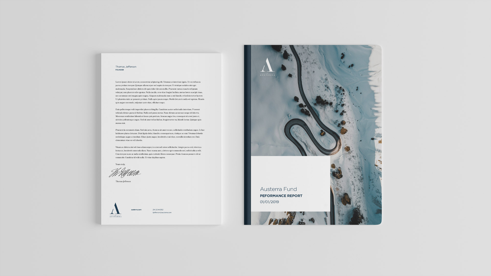
The design system that followed
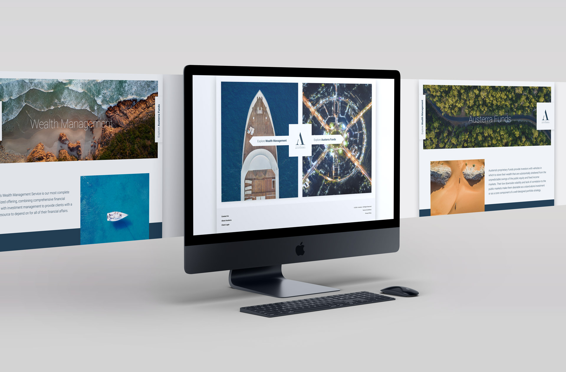
The website carries on the brand system’s simplicity and stark elegance to its logical conclusion. What few frills exist on the site are subtly and deftly executed to support a user experience that either leads to or supports long-term relationship with
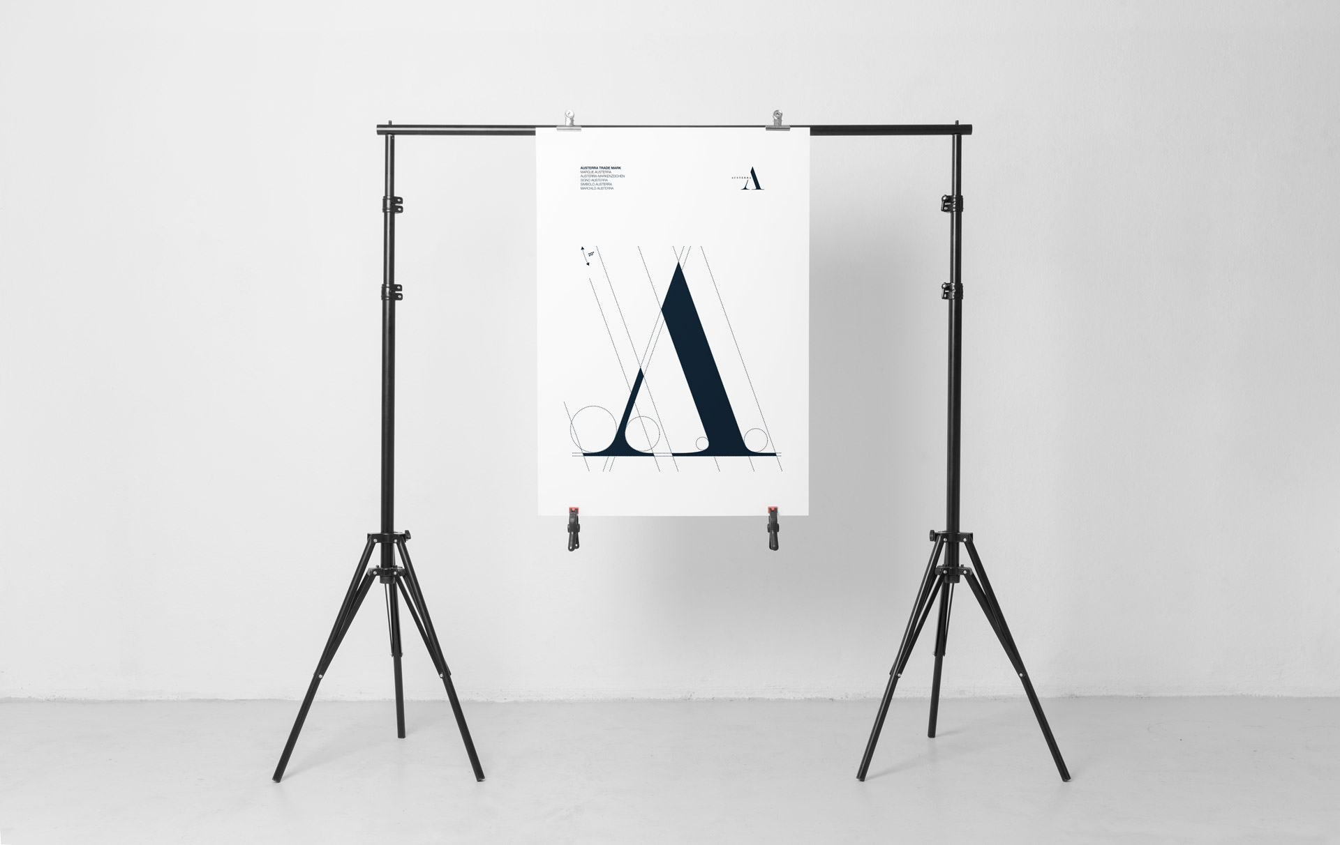
We were so enamored with the logomark and its geometry, that we created a limited run letterpress poster as a thank you to our client.